
ABSTRACT
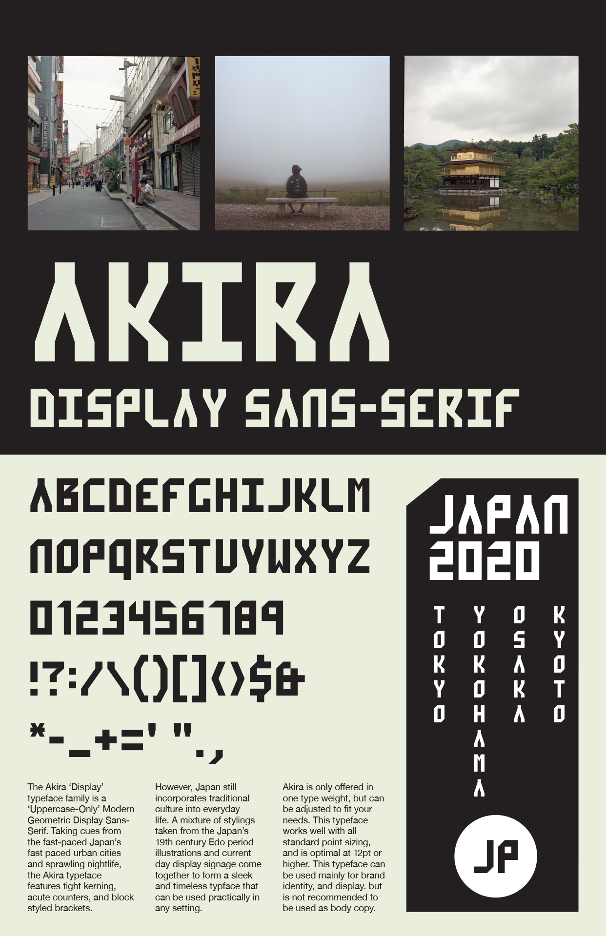
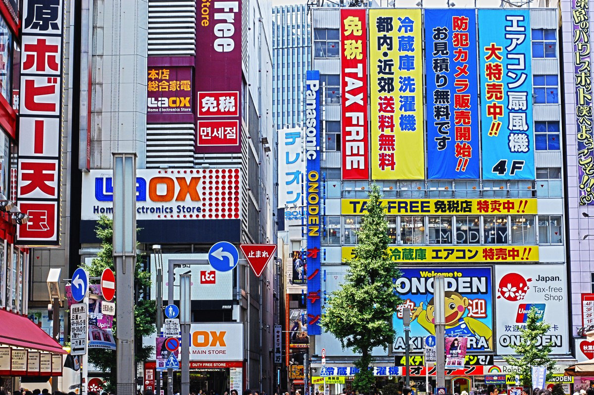
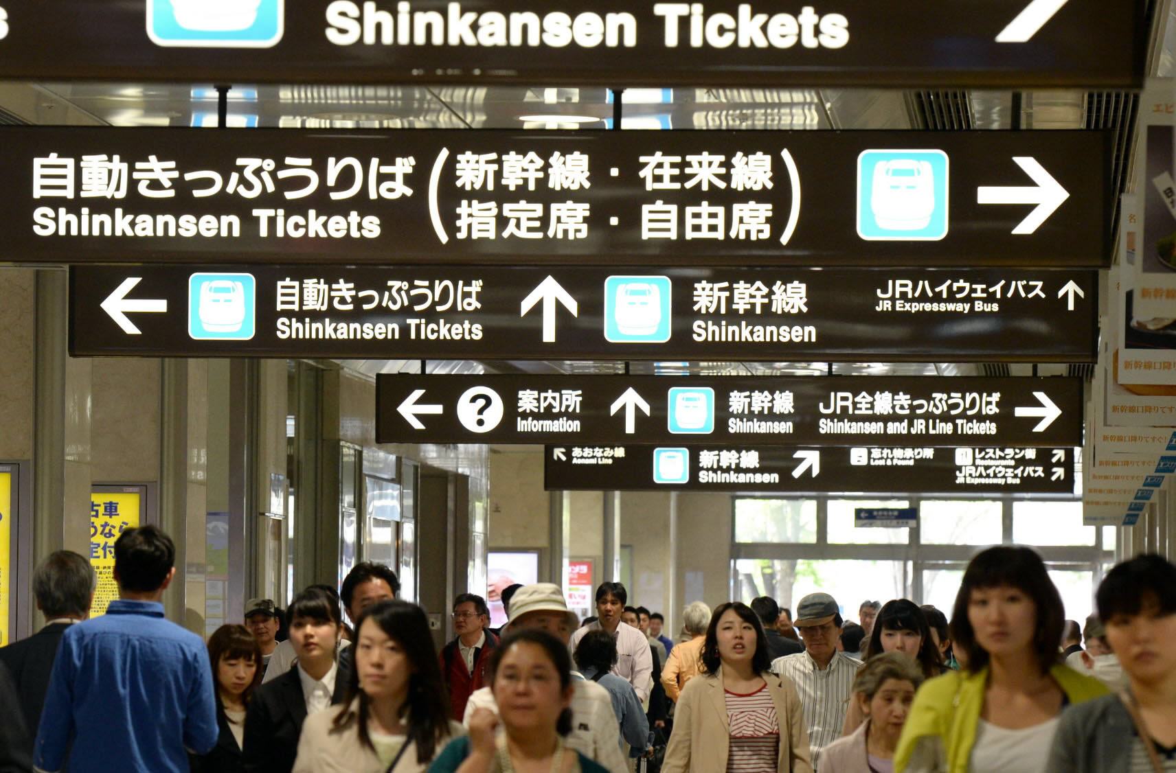
Designing your own typeface can be a rewarding, yet challenging experience. The hardest part is understanding the relationship between character kerning, line-height, X-height, and cap height. Without understanding these principles, designing an effective typeface that communicates with the viewer will be impossible. After many trials and error, I have decided to create a three sans-serif typefaces that are inspired by my all time favorite place to visit in the summer, Japan.
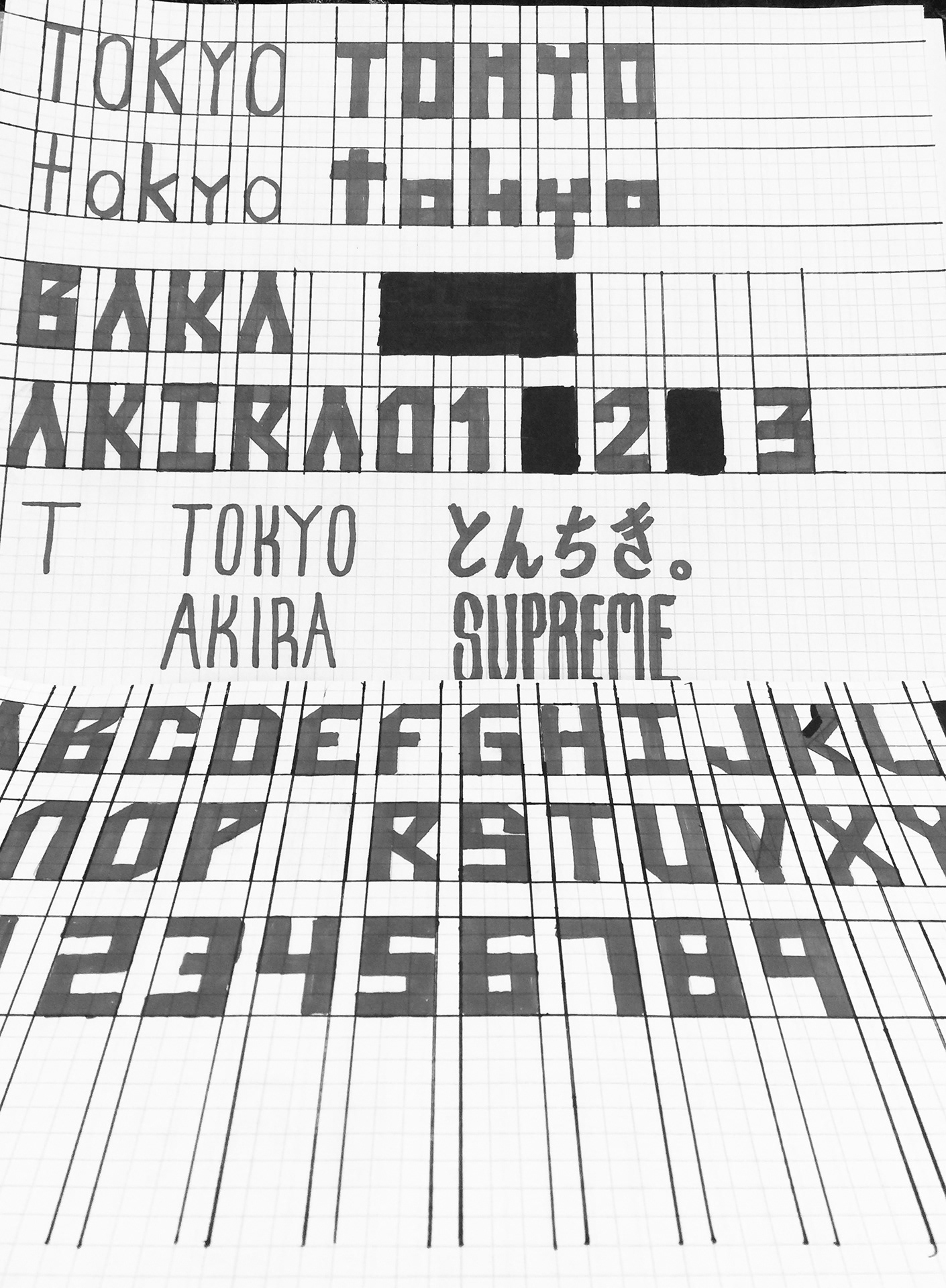
DESIGN INSPIRATION & Prototype SKETCHES

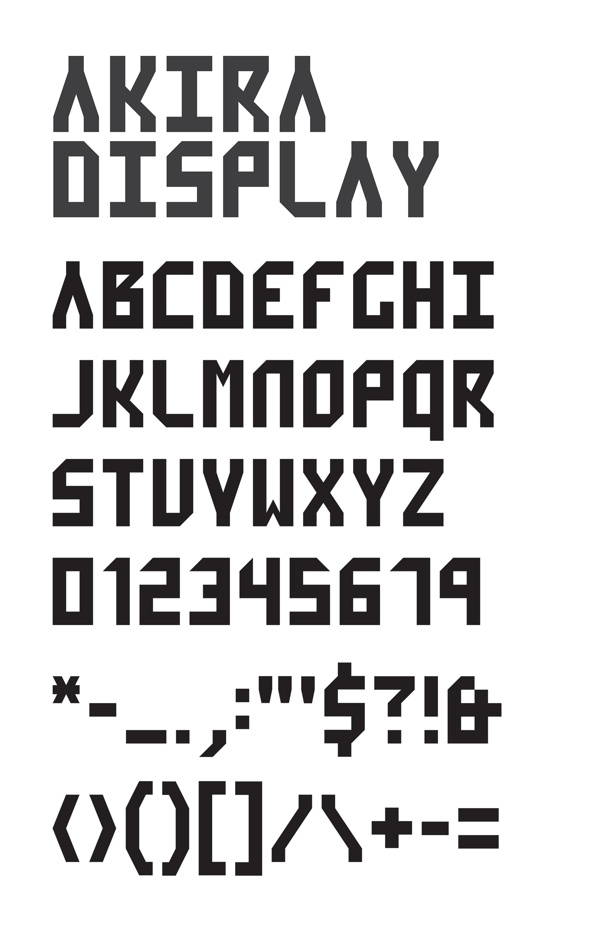
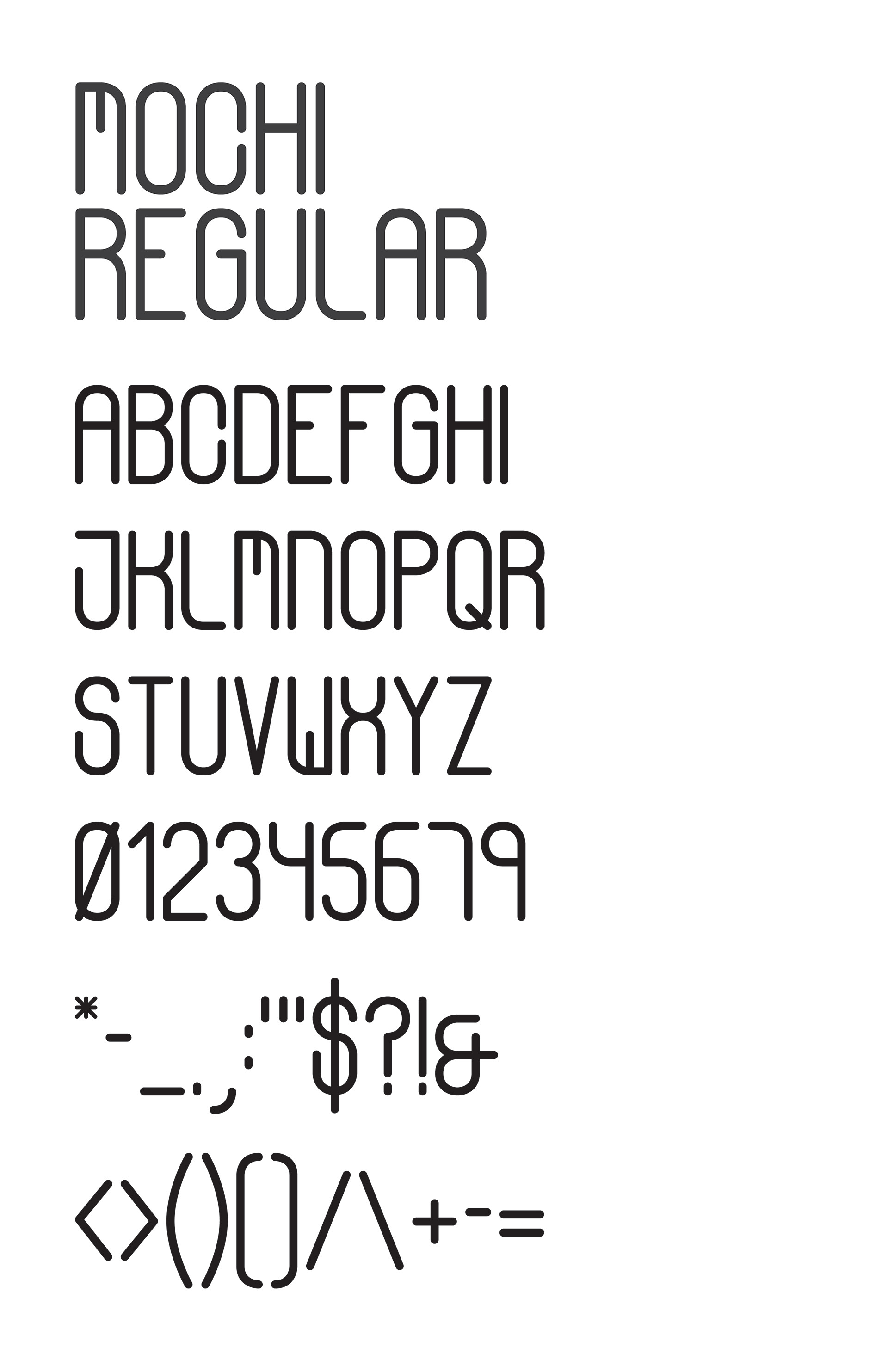
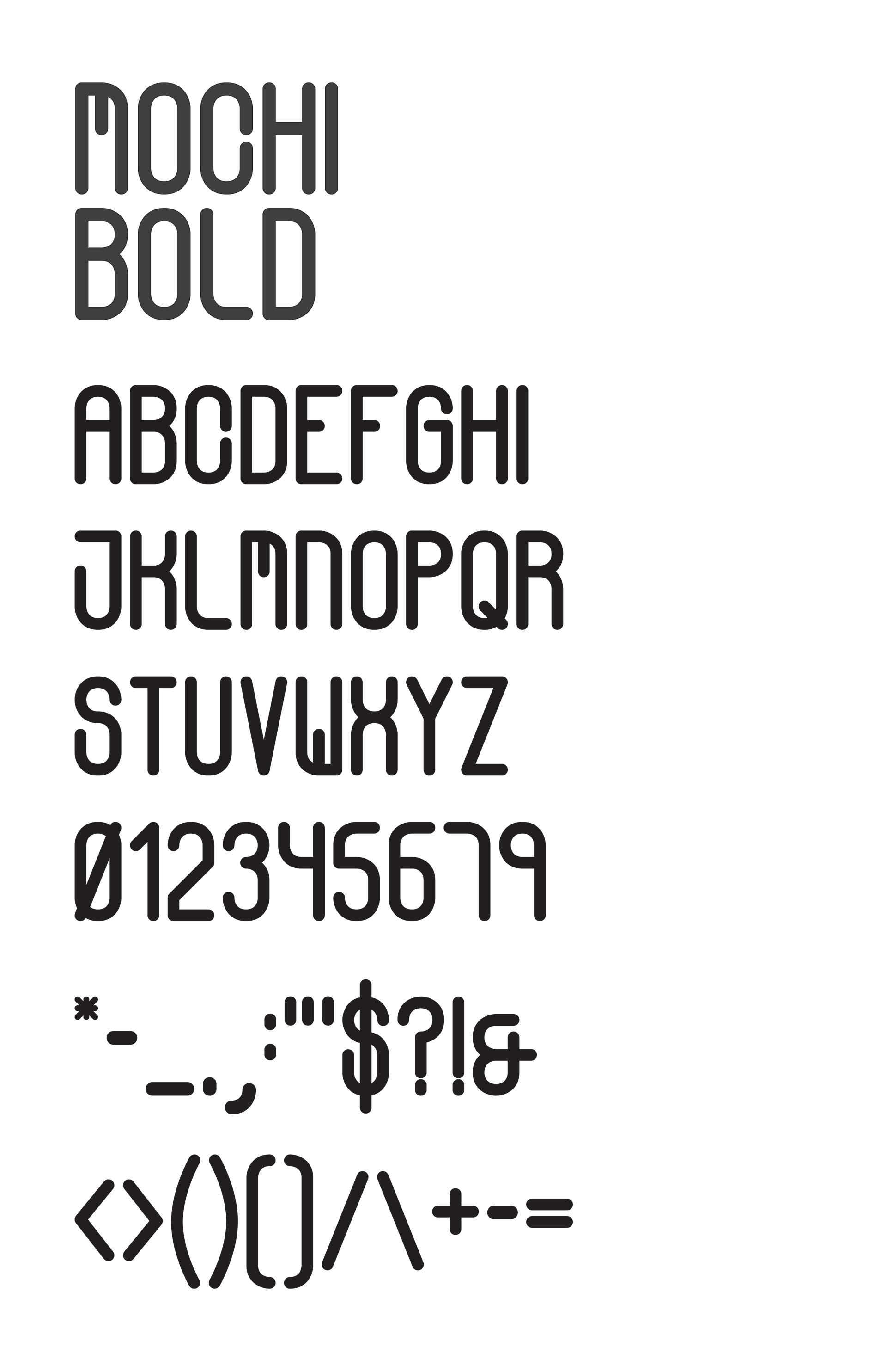
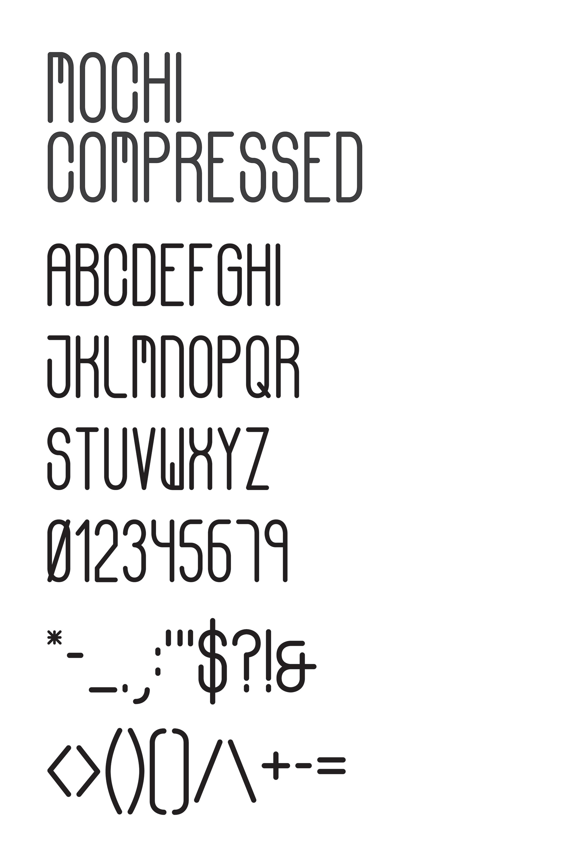
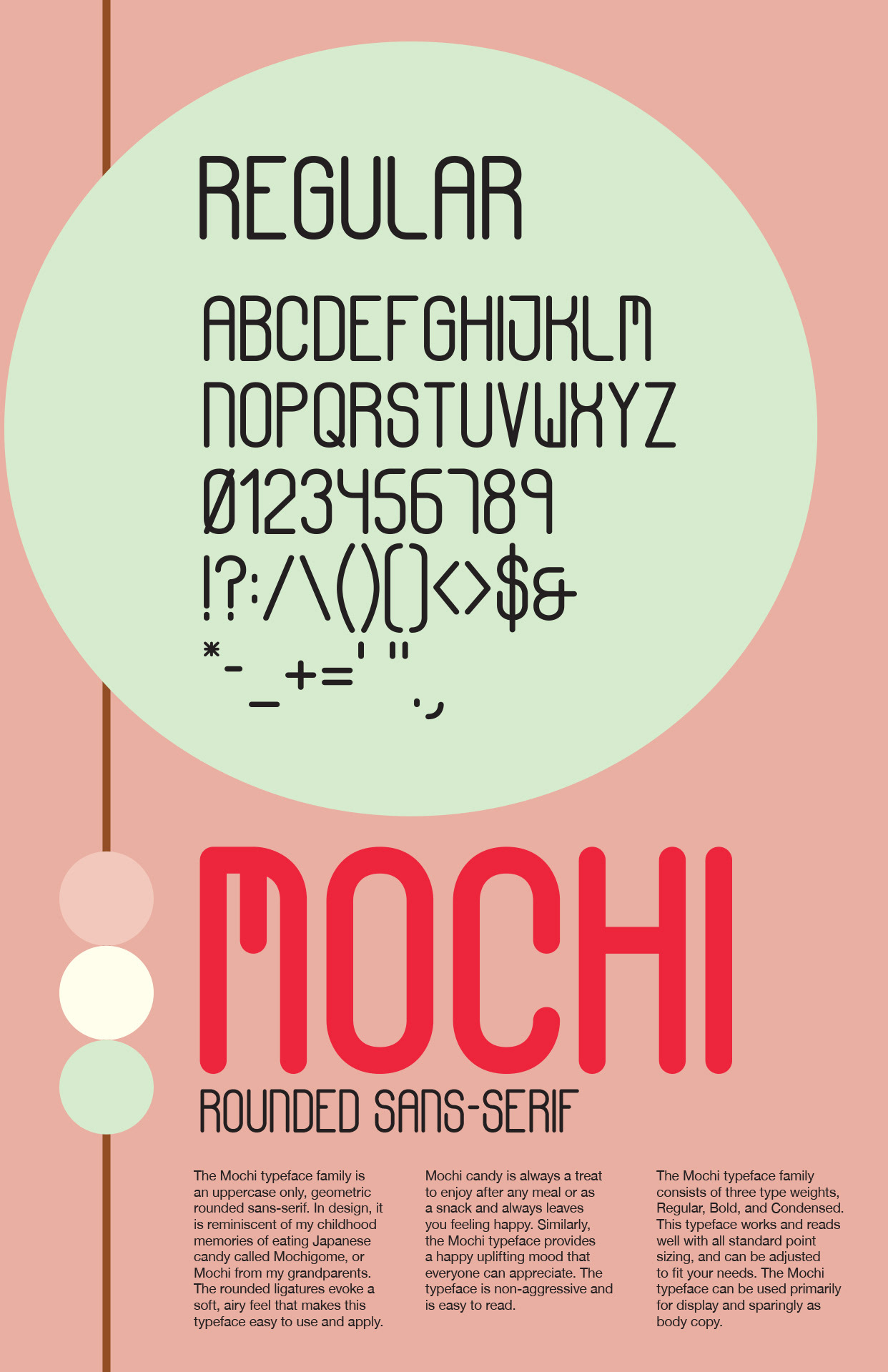
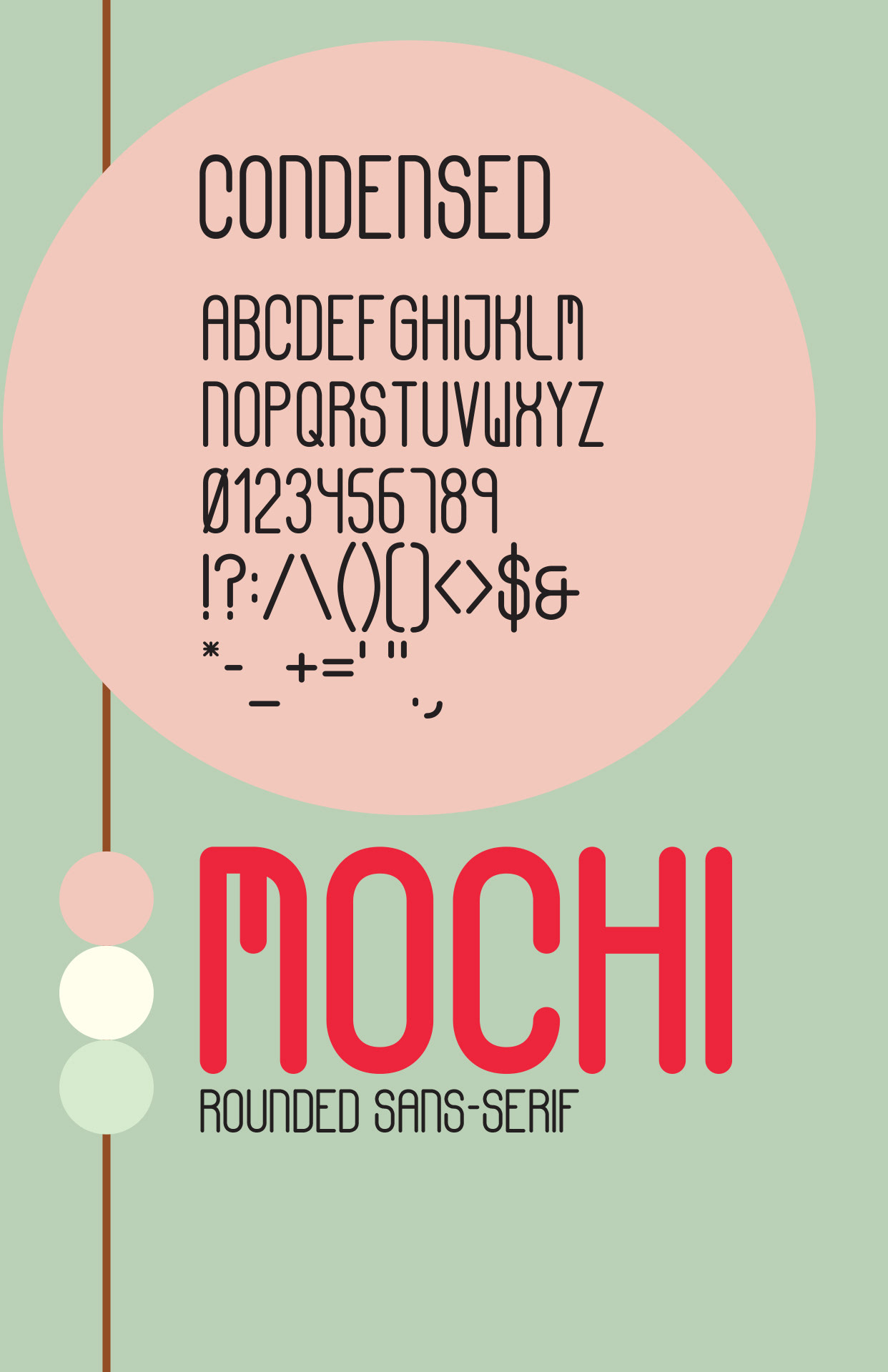
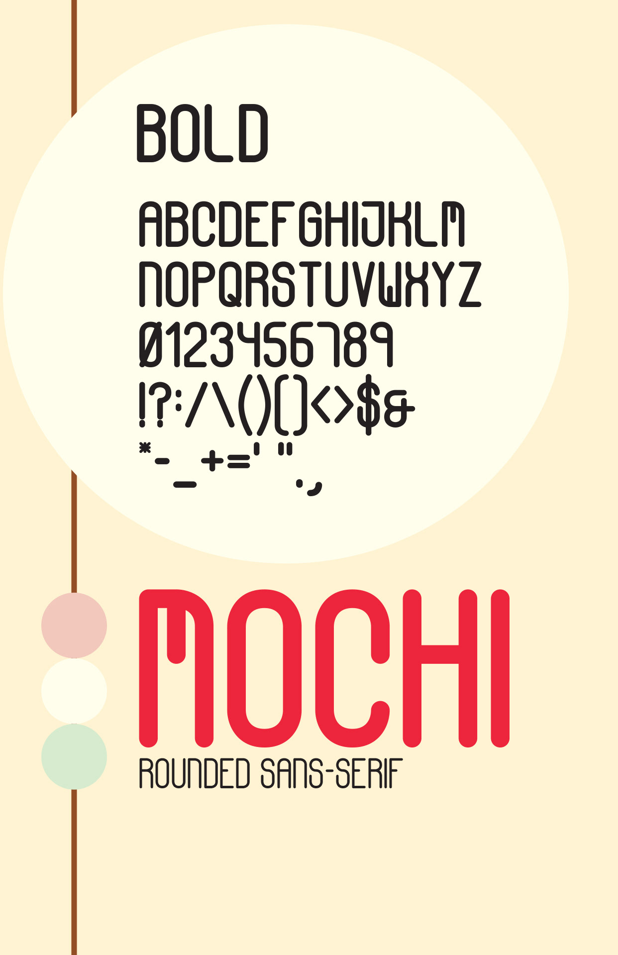
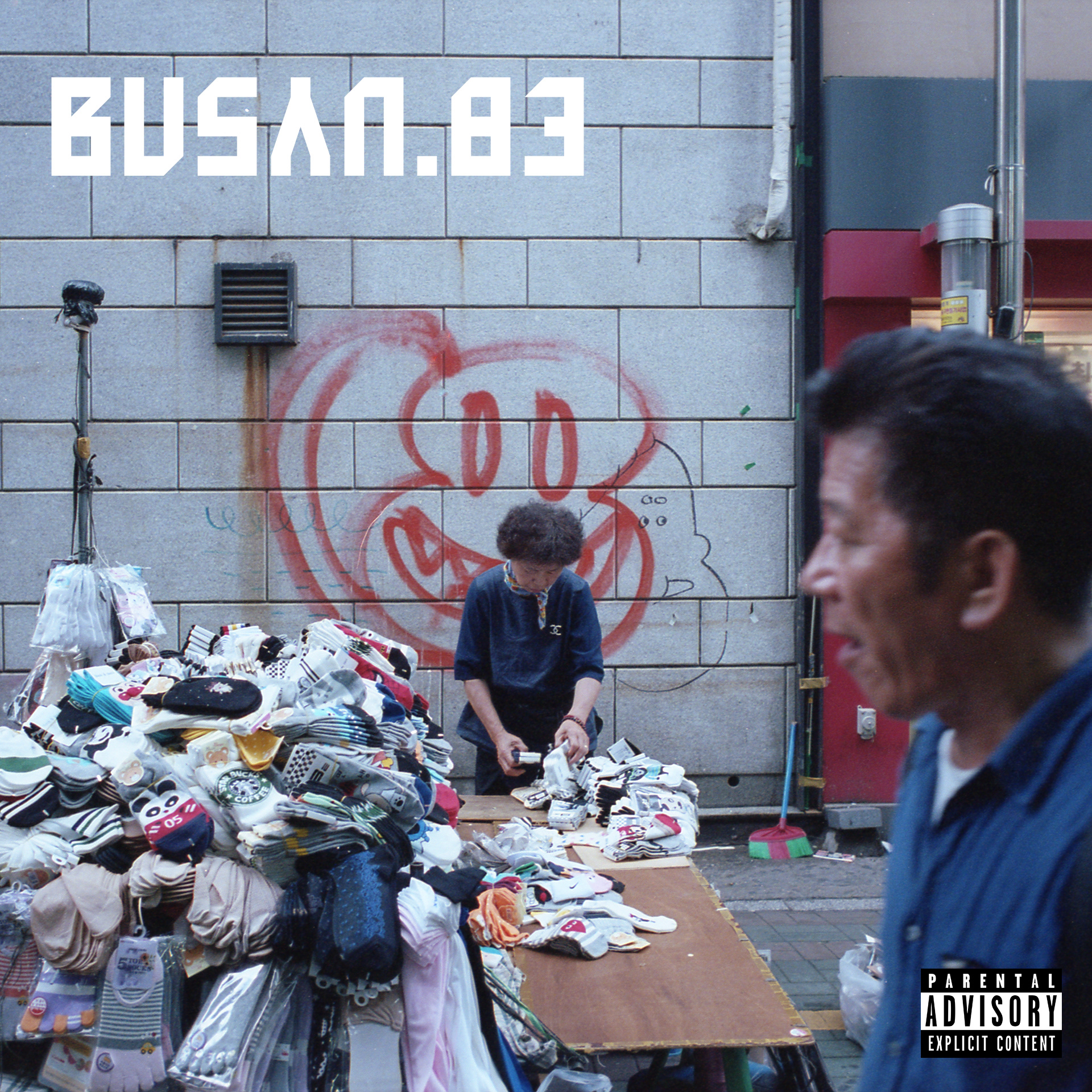
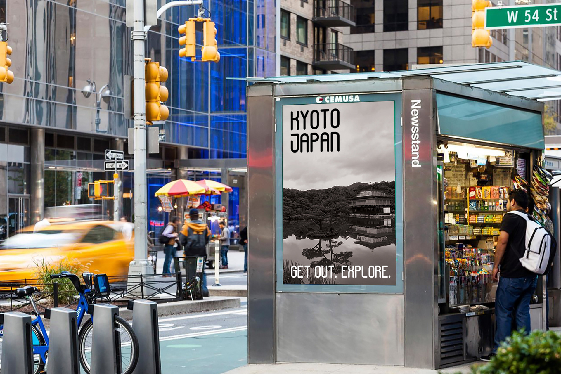
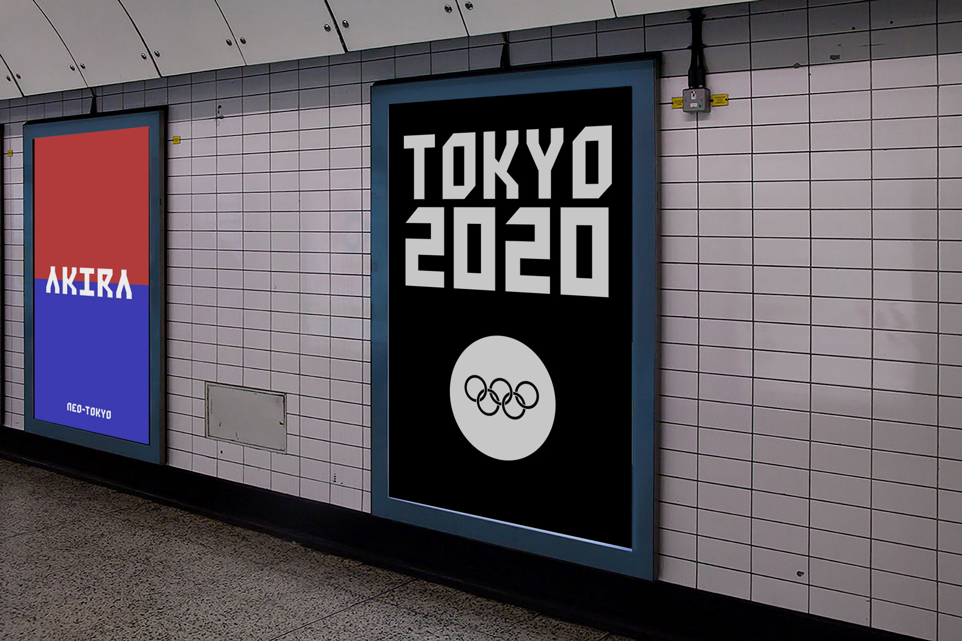
Final AKIRA & MOCHI TYPEFACES